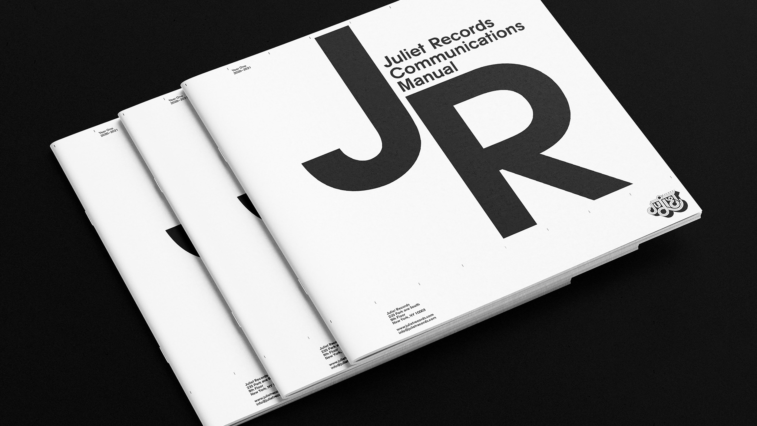
COMMUNICATIONS MANUAL
As we’ve spent our first year developing our visual identity, our Communications Manual served both as a progress diary and a set of branding guidelines. An updated version will be printed each year and shipped along with our physical product orders.
Logo Development
The Juliet Records logo was developed and designed by Charlotte Delarue, who’s been working with Chromeo since 2007. As an alumnus of the famed Parisian design house Surface To Air, she played a crucial role in building Chromeo’s visual language.
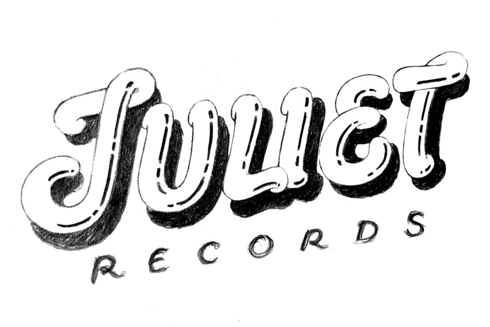
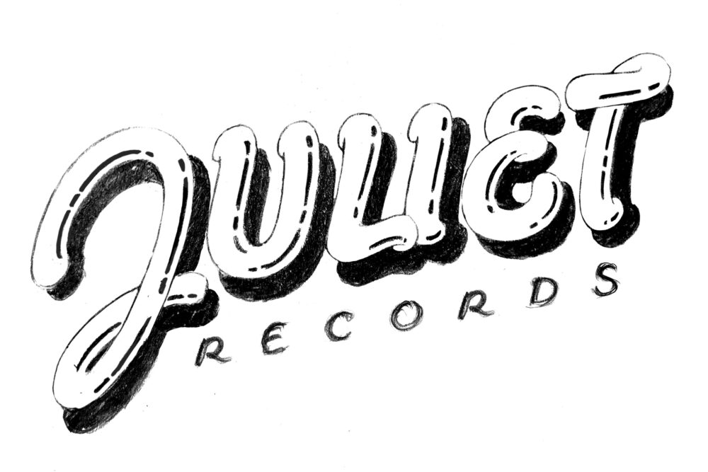
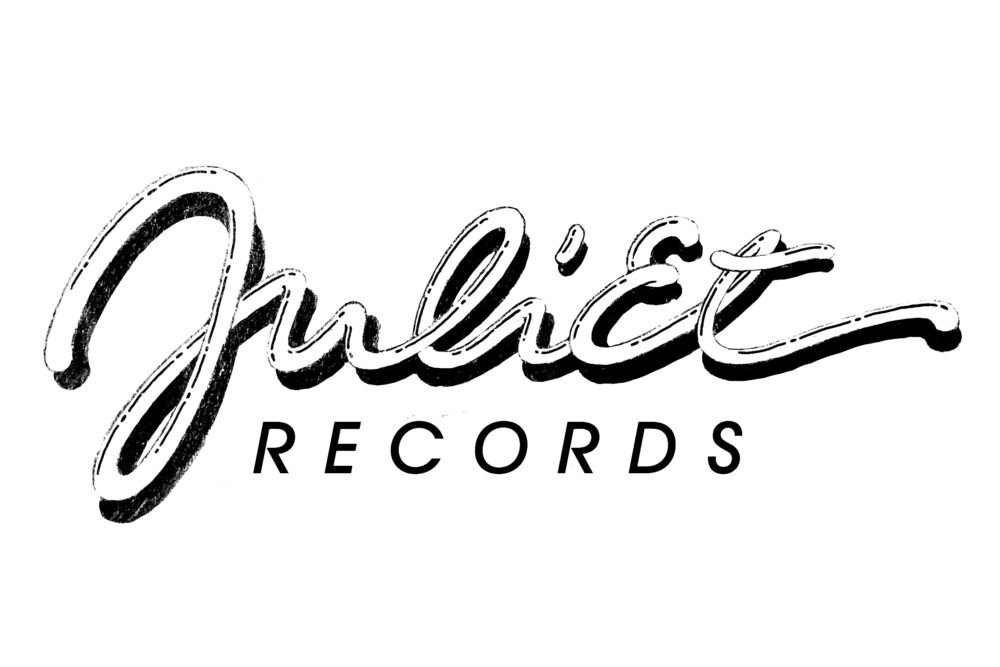
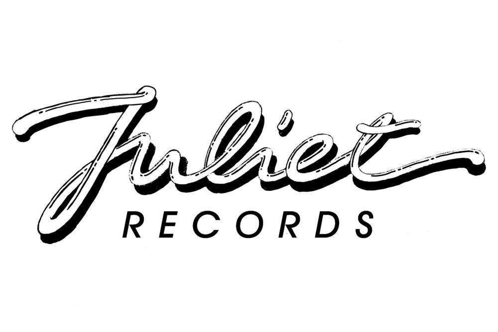
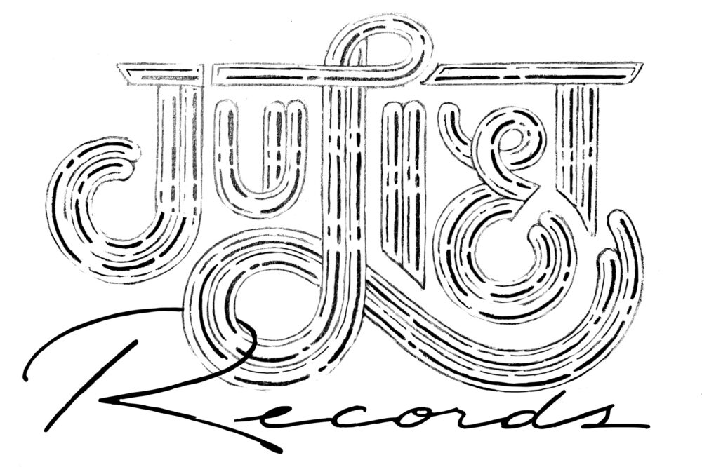
The early versions of the Juliet logo referenced French calligraphist Jean Larcher’s Fantastic Alphabets.
Another Jean Larcher-influenced design.
Two additional versions, this time in line with Charlotte Delarue’s signature cursive calligraphy.
The first iteration of another direction: the idea here was to make something almost purposefully unprofessional, akin to the free-form, back-of-napkin logos of 1970s businesses. Think a Portuguese dry cleaner, or a garage in the South of France. The J and the L, connecting with the horizontal top stripe, naively hint to musical notes.
Further development.
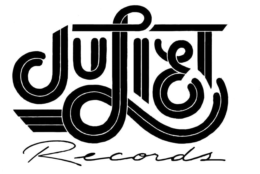
Final logo:
Animated color application.
Final logo:
Animated b/w application.
Juliet Grotesk Typeface
Juliet Grotesk is the label’s official typeface, designed by Matter Of. It is in the style of classic Swiss/German sans-serif typefaces like Akzidenz-Grotesk and Univers, but also draws inspiration from geometrical headline fonts like Avant Garde.
The typeface is versatile enough to accommodate the variety of Juliet’s release artworks and retro enough to be cohesive with the logo created by Charlotte Delarue.
Juliet Grotesk has variations for different applications: a regular version for smaller texts, an alternative version for headlines and a display version for very large sizes.

Juliet Grotesk comes in two versions, a regular grotesque and an alternative, more geometric style.
Letter “g”
The Geometric Juliet Grotesk Alt is noticeably wider. Additionally, the descender is different.
Letter “e”
The Juliet Grotesk Alt offers a different under stroke.
Letter “b”
As with the letter “g”, the belly is constructed differently.
Display Typeface
The Display weight of Juliet Grotesk was created for our larger titles and other grandiosities.
A little indentation in the corner of a letter is called an ink trap. In the analog letter press, they used to be a practical solution to avoid excess ink spillage on paper. In the digital age, ink traps have been rediscovered as playful, stylistic elements in typographical design.
Grid System
The Juliet Records identity is based around a voluntarily noticeable grid system, in other words, the grid system considered as an aesthetic object. Columns are indicated by small notches at the top of every page or medium. Pages are separated into a header section, a body section for the main content and a footer section, reserved for address, logo, ancillary information and running titles.
In graphic design, the grid has been pronounced dead many times over, to no avail: it remains the most useful tool for clean yet lively and variable designs, where it allows images and text to unite into one cohesive system.
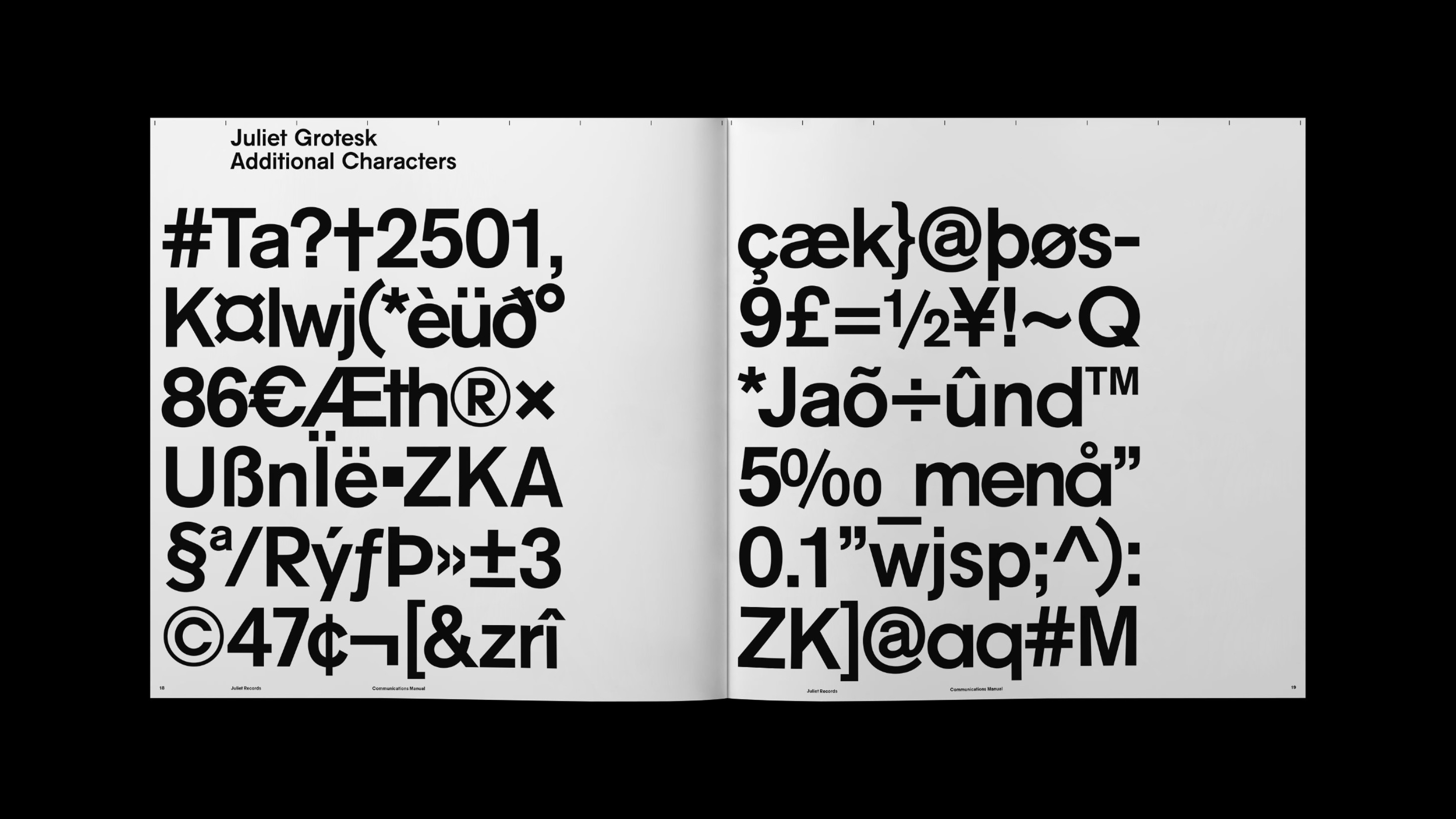
A typeface does not simply consist of 26 lower and uppercase letters. Numbers, punctuation, accents and sometimes even a variety of alphabets need to be carefully drawn to enable translation and cross-cultural communication.
12" Housebag
The Juliet Records 12” single generic record sleeve, better known as housebag, was also designed and developed by Charlotte Delarue. It will be used for all releases in our Remix Program, where songs from our catalog are reinterpreted by our favorite electronic musicians.
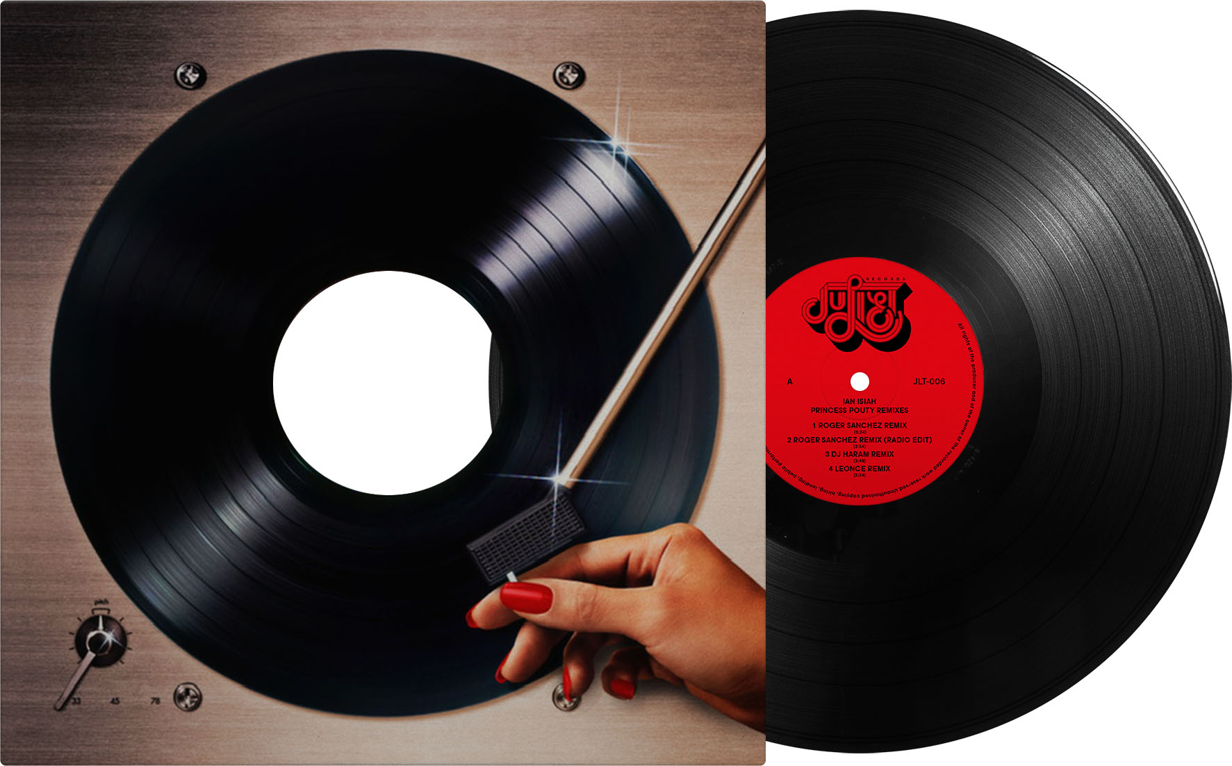
Final design: an ode to the great disco 12” sleeves of the 1980s, with a special nod to Capitol Records’ trompe l’oeil artwork. It should be noted that the greatest disco housebag art is arguably from Unidisc: a disco label from Chromeo’s hometown of Montreal.
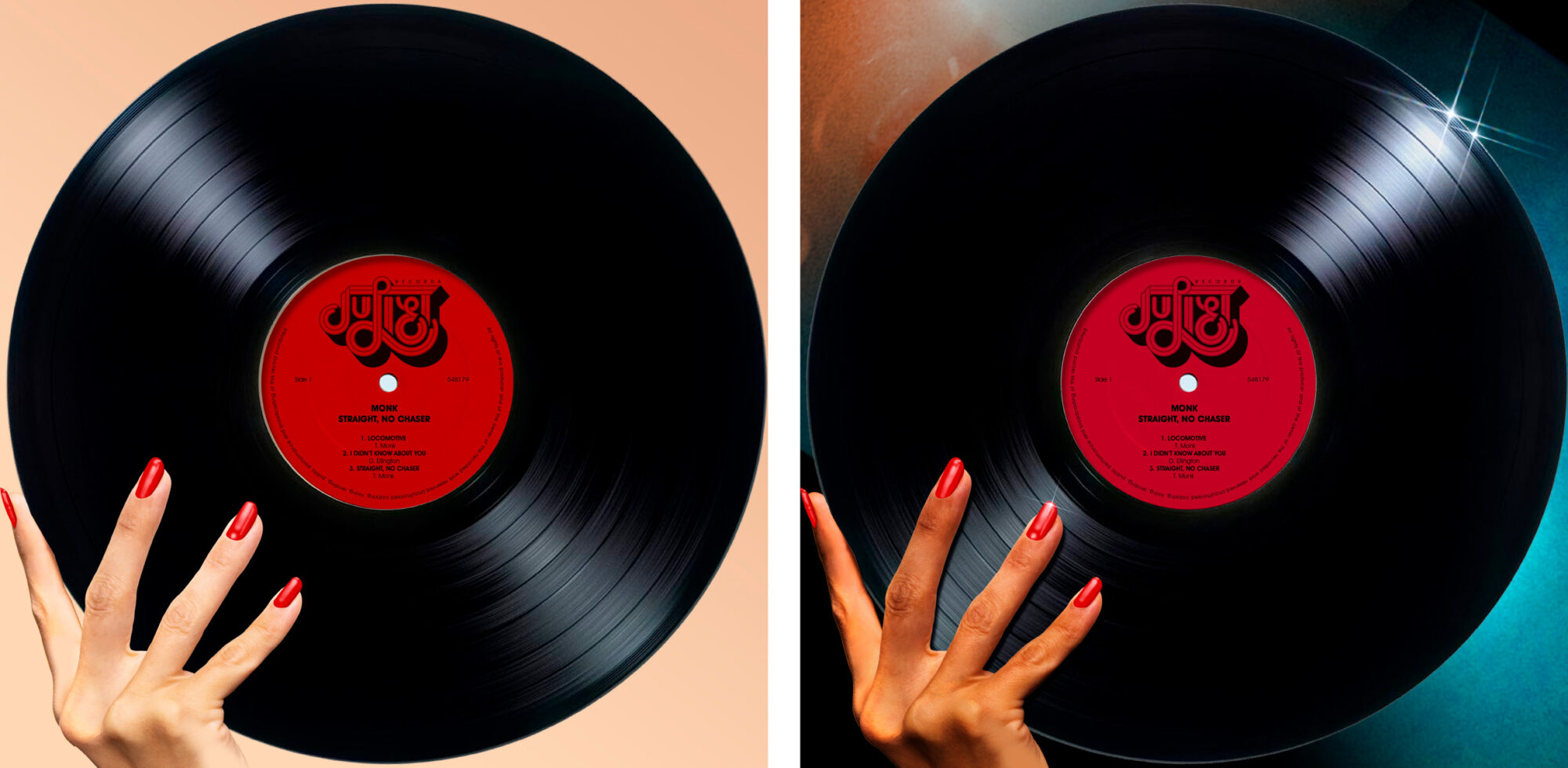
Early mockups
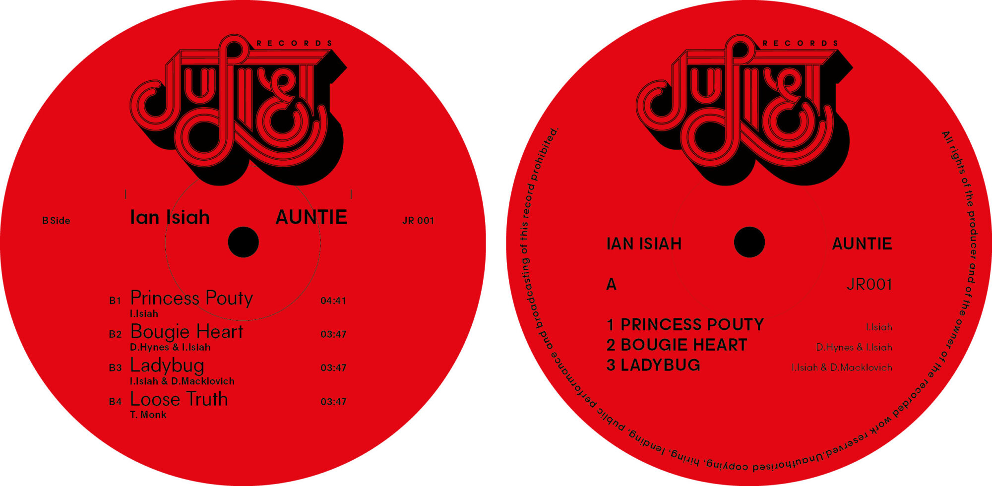
Early versions of the center label, which is in turn a nod to Columbia Records, in both color and layout.